Creating rough ideas for character designs
Daisy Jackson / 21/02/2023
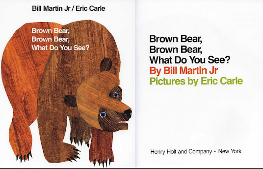
After looking into children's books, I decided to create my own designs for the character of my own book. I tried a mixture of approaches - a lot of these I was not used to so it caused me to break out of my comfort zone.
Here are my character designs:
I tried my best to make these illustrations as childlike as possible as this has a more personal touch to the characters. I kept the colours green since obviously my chosen colour is green. I am not exactly happy with these as they did not produce enough personality as I originally wanted. They seem too messy and not interesting for the child. I also do not know how I would develop these and make them interesting for a storyline. I am however leaning more towards character 2 as there seems to be more personality in this one. Character 1 just seems like a strange blob character - it does look unique though which is what Iwas going for!

Once again, I tried to go for a childlike presentation - however, these character designs are way too childlike and I feel might take away from the storyline. They have a lot of texture but they're not really interesting to me and don't really stand out too much. They seem too generic. Character 3 is also quite creepy with the teeth. Character 4 is quite messy and fits an interesting personality, however, too messy for me.
I quite like the texture of these character designs as one is very simple yet the other has a light texture to it mixed with some smooth layers. Interestingly, character 6 is an old design of mine that I created during my foundation year and drew a lot at one particular stage. My style has changed quite a lot since this character which is why I stopped using it. I feel like bringing this character back will be fun and interesting to see what I can do with it!
I decided to go with character design 6.
Here are some snippets of old drawings I did with this character in the past:
I then decided to texturise the dinosaur character I created:
This is my original design with no texture.
I like this texture as it is long grass and fits in with the nature theme. However, I do not like how much it spills over the edge. It also is not very subtle and is quite messy.
The same applies to this design and is way more messy. I don't think I like this particular design as I wanted a more subtle texture now thinking back on it.
This one, despite being messy like the other two, is a lot better in my opinion. As you can see the individual leaves for the textures, it appeals more and fits in better with the 'nature look'.This is definitely my favourite so far as it has a subtle texture to it that still resembles the illustrations I have looked at for the children's illustration books. I think it works really well and makes the design look generally more exciting.
The same applies for this deisng as it has an excitement to it. Less subtle but the texture is visible and is not an eye sore. It is also quite neat!


Comments
Post a Comment