Making the front cover - 06/03/2023
Making the front cover
Daisy Jackson / 06/03/2023
To begin with developing this idea further, I decided to play around with the front cover of 'Different shades of Moe'.
I wanted to focus on the colour green obviously and wanted this evident in the front cover.
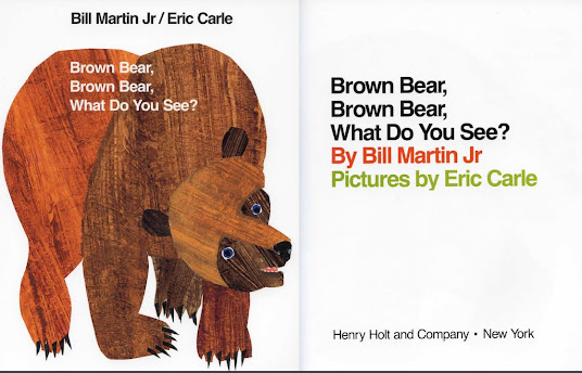
Here are my experiments:

With this one I thought the background was too boring. When looking at books for children's illustration I noticed that there were a lot of textures involved. I decided to experiment further with this idea.


I also love how I altered the text colour to a mixture of greens as this at least is more playful and more
visually pleasing. You can clearly tell the colour focus is green.

I do not like this one at all. Too much is going on and it seems to be an eye sore. It isn't the worst but it definitely isn't the best - too overwhelming!

Too basic and not enough texture. Comes across like not a lot of thought has gone into it.
After creating this version I thought it would be great to experiment with blending.

After this I decided to play around with both the front and back cover.
I got a few designs I am very fond of!

So at the time, I felt like this was my best choice. But once again, I thought I could do better. I decided to play around with more designs and ideas now that I had a front and back cover going.
The great thing with this is that I can always alter these ideas. Nothing is set in stone yet which is perfect for this project.

I do love the contrast between the light and dark green though!


I love the colour combination but felt like the leaves were too overpowering. However, I can see the text which is a great improvement from the previous.

This. This is my favourite design so far. Everything has came together really nicely. Everything compliments each other well and fits the style I was going for! And more importantly...I can see the text!


Comments
Post a Comment